CHRISTINA, EMMA & ROB - 'SHADOWS' FINAL VIDEO from cmdiploma on Vimeo.
Friday 19 March 2010
1. In what ways does your media product use, develop or challenge forms and conventions of real media products?
Part one.

(click image for larger size)
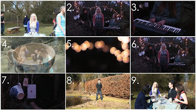
1. This frame/shot represents the link between the song lyrics and the visuals. The relationship between the two is open to interpretation – The lyric is ‘i’m moving on, i hope you coming with me’ the visuals that connect to this is where our lead singer is in normal motion but our extra’s are in fast motion which suggests that she wants to move on and be at the pace the extras are at however she wants ‘you’ to go with her..
2. This shot displays the way in which the record company would want their artists to be represented – as you can see the lead singer is in front whilst the bassist and keyboardist are behind playing their own instruments creating the image that they are real and completely produce their own music.
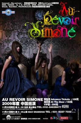
3. This shot illustrates the band and the music genre - Au Revoir Simone are a keyboardist indie/pop band, so the use of a mid shot of the keyboard helps represent this. This shot is taken from the part of the song that’s instrumental and you can really hear the keyboards, which also helps emphasis this.
4. This is one of my favourite shots; it represents an intertextual reference, which is of course the Mad Hatter’s Tea Party from Lewis Carroll’s Alice in Wonderland. The shot has a table full of guests (all characters from alice in wonderland – including the mad hatter) with a faded close up of a teacup with glitter being poured into it over the top.
5. This shot displays the use of camera by showing how I used the auto/manual focus option on the camera to get the lights at our band performance out of focus coming into focus.
6. This shot shows our use of lighting in the video. Our most key source of lighting was in the band performance where we hung fairy lights in a tree, which looks effective and creates a fairy tale atmosphere we were going for.
7. This shot demonstrates our mise en scene highlighting our intertextual reference also as it shows a teacup and playing card (props) hanging in the tree (setting).
8. The video I looked at that inspired this shot was Vampire Weekend - Cousins, which from 1:48 to 2:01 they use a stop motion effect to change the band member singing. Here we have done something similar by using the stop motion to have our Wonderland characters change. This shot shows the first of our stop motion which is our Mad Hatter character.
9. This shot also repersents our stop motion effect inspired by 'Cousins'.
1. This frame/shot represents the link between the song lyrics and the visuals. The relationship between the two is open to interpretation – The lyric is ‘i’m moving on, i hope you coming with me’ the visuals that connect to this is where our lead singer is in normal motion but our extra’s are in fast motion which suggests that she wants to move on and be at the pace the extras are at however she wants ‘you’ to go with her..
2. This shot displays the way in which the record company would want their artists to be represented – as you can see the lead singer is in front whilst the bassist and keyboardist are behind playing their own instruments creating the image that they are real and completely produce their own music.
3. This shot illustrates the band and the music genre - Au Revoir Simone are a keyboardist indie/pop band, so the use of a mid shot of the keyboard helps represent this. This shot is taken from the part of the song that’s instrumental and you can really hear the keyboards, which also helps emphasis this.
4. This is one of my favourite shots; it represents an intertextual reference, which is of course the Mad Hatter’s Tea Party from Lewis Carroll’s Alice in Wonderland. The shot has a table full of guests (all characters from alice in wonderland – including the mad hatter) with a faded close up of a teacup with glitter being poured into it over the top.
5. This shot displays the use of camera by showing how I used the auto/manual focus option on the camera to get the lights at our band performance out of focus coming into focus.
6. This shot shows our use of lighting in the video. Our most key source of lighting was in the band performance where we hung fairy lights in a tree, which looks effective and creates a fairy tale atmosphere we were going for.
7. This shot demonstrates our mise en scene highlighting our intertextual reference also as it shows a teacup and playing card (props) hanging in the tree (setting).
8. The video I looked at that inspired this shot was Vampire Weekend - Cousins, which from 1:48 to 2:01 they use a stop motion effect to change the band member singing. Here we have done something similar by using the stop motion to have our Wonderland characters change. This shot shows the first of our stop motion which is our Mad Hatter character.
9. This shot also repersents our stop motion effect inspired by 'Cousins'.
2. How effective is the combination of your main product and ancillary texts?
There are many different factors in which my Music video, Digipak and Magazine advert are linked together. I created this image on Photoshop displaying and annotating these factors.


(click image for larger size)
Text included:
The setting had a huge role in our video as it perfectly fit all our idea’s together creating the atmosphere we had hoped to achieve
This is how I came up with the Tree idea for my digipak. I wanted something other than an image from the video or an image of the band and I thought this would link in with the video (band performance location/setting) and the band itself in a different but effective way. I think having a graphic instead of a photo also helps my digipak look more professional as if i had just used scree grabs from my music video which would of been low quality.
Lights were a big part of our music video therefore I knew I wanted to incorporate them in my digipak designs, it helps that I have a love for out of focus lights
The dominate colour I used for my digipak was based around the screen grab I used of the out of focus lights. There is an obvious green colour to the image which I wanted to bring out more and make more intense, which created this teal/green colour.
The typography I used is consistant throughout my digipak and magazine advert. The font type is called Perpetua and although the sizes vary I kept the band name larger than the album title on both advert & digipak.
3. What have you learned from your audience feedback?
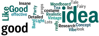
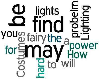
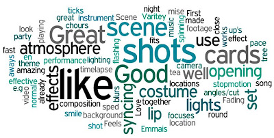
I created tag clouds for all of my feedback using wordle. I used a colour scheme of teal, green, black and grey so they link in with my digipak. This is useful to see the common factors of my strengths and weakness as seen by other people. The larger words are the words most used in my feedback.
Treatment/pitch for Shadows

Treatment/pitch for Shadows
The feedback was mostly positive for our treatment, however a key concern was the power for our lights idea. So we came up with a plan to make sure this wouldn't be a problem. This was to set our video at Long Road and use power from a near by classroom which we would need to ask permission for.
POSITIVE:
NEGTIVE:
Rough cut
POSITIVE:

NEGTIVE:

Rough cut
The main concern with our rough cut was the giggling, which we had planned to cover up with cut-aways, so the feedback we received for our rough cut was actually really good and gave us that confidence to experiment more with our out of focus footage.
POSITIVE:
NEGATIVE:
Digipak mock up
POSITIVE:

NEGATIVE:

Digipak mock up
Although the response to my feedback was unexpectedly positive, I really wanted to take a different approach to the task, which is why my final digipak is completely different to my mock up. The main reason I wanted to create something different is because I knew most people were just using stills from their footage so it would be very image based - I wanted to create a graphical image which is something more of the band style (as their prevouis album artwork has been like this).
Finished video (Ben Gee)

Finished video (Ben Gee)
The feedback for the final video was really positive, I still don't feel my music video is very strong so it's reasuring that other people see it for its hard work. The feedback Ben Gee gave us for the video made me happy - especially when I read 'Out of focus shots very good' - It amazes me that something unintentionally that was a problem at the time actually worked in our favour helping us create a more interesing final product.

Thursday 18 March 2010
4.How did you use new media technologies in the construction and research, planning and evaluation stages?
These are two images of me using the equipment for the project
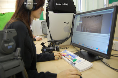
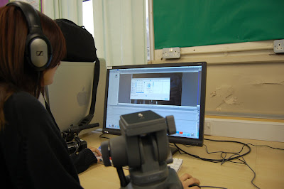
1. Sony HD Camera - we took full advantage of this camera using the HD settings and using an HD tape, however we did face a problem whilst filming the band performance, this being that because it began to rain the camera kept losing focus. This wouldn't of been such a problem if we hadn't used a plastic bag to protect the camera from the rain as I couldn't tell this was happening - If I had noticed I could of used the manual focus option to prevent this from happening. To overcome the problem in editing I had the idea to fiddle around with the opacity and create layers - I think this worked well in disguising our out of focus footage well.
2. Final Cut Express - we used this to edit on and bring our music video footage together, using the tools and the effects the program has to offer. We also created our animatic on here. I also used Final Cut to slow down part of our song so that we could have everything in fast motion but with our lead singer in normal motion. I had never done this before but it was very easy
to achieve with a little guidance from my teacher.
This is an image of all the programs I used for this project
 I also used non technologies for this project as I made a lot of the props we used - good old arts and crafts.
1. Sony HD Camera - we took full advantage of this camera using the HD settings and using an HD tape, however we did face a problem whilst filming the band performance, this being that because it began to rain the camera kept losing focus. This wouldn't of been such a problem if we hadn't used a plastic bag to protect the camera from the rain as I couldn't tell this was happening - If I had noticed I could of used the manual focus option to prevent this from happening. To overcome the problem in editing I had the idea to fiddle around with the opacity and create layers - I think this worked well in disguising our out of focus footage well.
2. Final Cut Express - we used this to edit on and bring our music video footage together, using the tools and the effects the program has to offer. We also created our animatic on here. I also used Final Cut to slow down part of our song so that we could have everything in fast motion but with our lead singer in normal motion. I had never done this before but it was very easy
to achieve with a little guidance from my teacher.
This is an image of all the programs I used for this project
I also used non technologies for this project as I made a lot of the props we used - good old arts and crafts.
Tuesday 16 March 2010
Getting in Touch
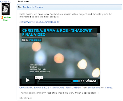
I just emailed Au Revoir Simone again (using Myspace, as thats what we used the first time round) giving them a link to our finished video, i wrote:
Hello again, we have now finished our music video project and thought you'd be interested to see the final product
(http://www.vimeo.com/10161045)
Thanks again, and any response would be very much appreciated :)
Christina
Hello again, we have now finished our music video project and thought you'd be interested to see the final product
(http://www.vimeo.com/10161045)
Thanks again, and any response would be very much appreciated :)
Christina

Peer Feedback
This video has a very sylish video. i like the effect that the lighting has and the editing goes well with the pace of the music.
Really goof work guys, i like the whole alice and wonderland theme, the blurring works really well on the performance shots!
Setting works well + props- clock looks amazing.
like Hannah's costume mostest!!
Convincing performances. xmas lights work well, good lipsync.
I like the spinning cards and the flickering lights, Emma does not move about much, but good
Good fade between shots. some of the cuts between shots don't work. like the out of focus shots.
Like the effects, very nice shots, like the out/in of focus shots.
Feedback from film-maker Ben Gee
Nice fades and objects in opening; good simultaneous zoom and fade; intriguing imagery makes you think and poses questions; whole band on location very good. Good effect on tea party; changing person and nice shadow; very smooth cuts; out of focus shots very good; use of lights very good.
Saturday 13 March 2010
This image was a real influence on me and my ideas for this project, I found it at the beginning of the project and it helped me create my treatment for Shadows. My group really thought that my idea based around the photo had potential and thus we came up with the pitch to get the song. I think it’s interesting to see how we took this and created something our own with it which best fit our ideas and style we were going for. 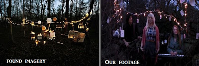
(Our footage is a screen grab so doesn't look as good as the found imagery photo)
The image I found is a lot more open with larger props (furniture) whereas our video is in more of a tight space – I think this works to our advantage as our props are smaller and there would have been too much open space if we had used a different location, which visually wouldn’t have looked as good.
Friday 12 March 2010
I've noticed that my final digipak is nothing like my mock up or first idea's
(reminder of what they are - http://musicvideocm3christina.blogspot.com/2010/02/digipak-magazine-mock-up.html and https://blogger.googleusercontent.com/img/b/R29vZ2xl/AVvXsEimn9A4_t77Y2olh-nrMI28I6PD1ckYIVDUmZ4oHajBlcX7iwrbnyEQcmlUZKVsKESWR92vf30QYD-oQJRdxXAsEuWOpDAejT1l0j7VUTE6uY0cDHsUWOFkC6HMBA-h9u7F6ce-Cnyjhwwl/s1600-h/IDK.jpg) nor the digipak's my group produced - I quite like that we all created very different digipaks and took a different approach to the task though, especially seeing as we've been working very closely with one another to produce our music video, and thus far our idea's have been fairly similar.
I think I prefer my final digipak (to my mock-ups) as it's simple and the colours work well together and the images are strong which helps everything fit together. It also fits in with our video, as our performance/locations are set outside in a forest and I also included out of focus lights which feature in our video.
However my first idea-using the teacup would of worked as well. It was is interesting to see that Emma had created her digipak around our tea party theme which works so well and is so cute! The imagery is strong and theres a clear link between the digipak and the video which is good.
If I Could, I Would Change...
A lot of things to be honest. I feel that if I had edited alone I would have a very different final video, however I enjoyed editing with other people as I havn't really done this before.. even if I did take over a bit.
Firstly I would of liked way more footage from our band performance, using different camera set ups etc
Secondly I would of made the video more around the performance (less tea party shots) using cut aways of the props in our tree and the lights as i think the performance footage is stronger than the tea party stuff
Lastly I would of liked the video to be more fast paced/have more cuts so shots arent held as long. (this could only be done with more footage.. which we just didn't have)
Deadline Day
Making final touches to our music video today
We feel pretty confident with it and will make the deadline for sure.

We feel pretty confident with it and will make the deadline for sure.
Nick was saying that we didn't have enough movement in some of our shots and that they are held for too long, although I took on board what he was saying, I disagree with it.
We did add a few movements to some clips using Key Frame points however I honestly prefer them without the movement, Steve is now teaching us so i'd like to know what he thinks of these changes.
When Steve came he said that he thought it had improved loads from the rough cut and that the only advice he would suggest is to make our tea party/day time shots black and white as because some of them the speed had been increased and it's almost comical in some parts (max) it reminded him of silent movies (Charlie Chaplin) so we should try it out. We did but we didn't like how we lost the gold of the glitter and the sparkle, so we decided not to go with this idea.
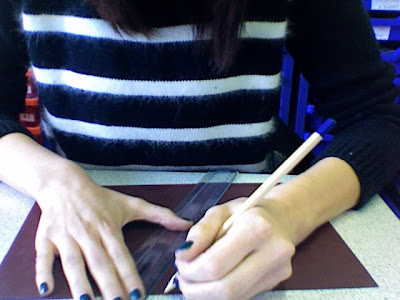
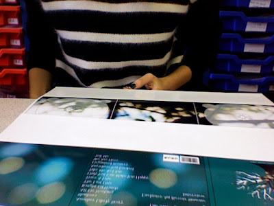
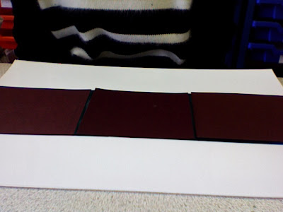
The Making of..
My physical digipak.
although I made a cardboard digipak, I didn't actually end up using this, because I didn't want my prints to be stretched over the cardboard, also it didn't close properly because the card was so thick.
Instead I created three card panels which I stuck in between the front and the inside of my prints.
(making the panels)
(My print outs)
(layering the panels on my prints)
I didn't take a photo of my finished physical digipak as I ran out of time, but it shall be handed in with this project.
although I made a cardboard digipak, I didn't actually end up using this, because I didn't want my prints to be stretched over the cardboard, also it didn't close properly because the card was so thick.

Instead I created three card panels which I stuck in between the front and the inside of my prints.
(making the panels)

(My print outs)

(layering the panels on my prints)

I didn't take a photo of my finished physical digipak as I ran out of time, but it shall be handed in with this project.
Thursday 11 March 2010

.jpg)

Wednesday 10 March 2010
Improved Digipak and Magazine advert
I re-edited my digipak and advert after gathering advice from my teachers and a few fellow class mates. I feel a lot happier after making these improvements.
Digipak:
The changes I made to my digipak probably aren't that obvious so i'll just tell you what I did..
Firstly, I made the album title 'Still Night, Still Light' larger so now its the same width of the base of the tree. Secondly, I changed the text 'Disc one' and 'Disc Two' so that they're now in capitals as the font I used seems to look better in capitals. Thirdly, I took the grainy effect green/teal from the back cover and side fold of my digipak and placed it behind my tree so that the colour scheme matches better (The faded lights didn't look right on the front cover so I took a bit of the image where there was no out of focus light.) Lastly I added lyrics from 'Shadows' to the side fold section of my digipak, so that it isn't an empty page now.
Magazine advert:
Unlike the digipak, the changes I made to my advert are a lot more obvious.
I stuck to my changes I wanted to make (as seen on my first draft advert post).
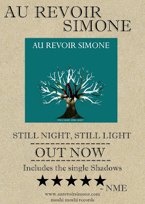
Firstly, I got rid of the brown parcel type background and made it the greeny/teal that I have on the front cover of my digipak. Secondly, I changed the font of all the text to the font I use in my digipak, which is called Perpetua (and deleted some unwanted text). Thirdly, I added the image of the tree from my digipak as the central image that links everything up (digi, advert & video). Lastly I changed the text moshi moshi records to their website and added 'at HMV' to the 'OUT NOW' part so people know where they can purchase the digipak.
I used NME and HMV as i've seen a review or advertisment for au Revoir Simone on the NME website and on the band website there is a downloadable press quote pdf which NME feature on three times. I also know that you can buy their albums in HMV, plus its convenient that both names are three letters long so fit in the poster well.
Digipak:
The changes I made to my digipak probably aren't that obvious so i'll just tell you what I did..
Firstly, I made the album title 'Still Night, Still Light' larger so now its the same width of the base of the tree. Secondly, I changed the text 'Disc one' and 'Disc Two' so that they're now in capitals as the font I used seems to look better in capitals. Thirdly, I took the grainy effect green/teal from the back cover and side fold of my digipak and placed it behind my tree so that the colour scheme matches better (The faded lights didn't look right on the front cover so I took a bit of the image where there was no out of focus light.) Lastly I added lyrics from 'Shadows' to the side fold section of my digipak, so that it isn't an empty page now.
Magazine advert:
Unlike the digipak, the changes I made to my advert are a lot more obvious.
I stuck to my changes I wanted to make (as seen on my first draft advert post).
Firstly, I got rid of the brown parcel type background and made it the greeny/teal that I have on the front cover of my digipak. Secondly, I changed the font of all the text to the font I use in my digipak, which is called Perpetua (and deleted some unwanted text). Thirdly, I added the image of the tree from my digipak as the central image that links everything up (digi, advert & video). Lastly I changed the text moshi moshi records to their website and added 'at HMV' to the 'OUT NOW' part so people know where they can purchase the digipak.
I used NME and HMV as i've seen a review or advertisment for au Revoir Simone on the NME website and on the band website there is a downloadable press quote pdf which NME feature on three times. I also know that you can buy their albums in HMV, plus its convenient that both names are three letters long so fit in the poster well.
10.03.10
Today I was editing solo as my group had other lessons to attend. I focused on covering up the shots where Emma giggles; I think I managed to remove all of them. I then decided to cut the song short as at about 3:10 the song becomes instrumental for like a minute and Nick said that it was long enough at three minutes. It would have been a pain to try and fill this to be honest as we didn’t really shoot anything suitable for this part, so that’s a relief.
I also spoke to Nick about my digipak and magazine advert as I’ve actually built a digipak I’d like to cover in my Photoshop designs, so I asked if I could print it in a3 to do this. He said I could only do this in Photography so I gave him all my Photoshop files and hopefully he’ll be able to sort something out for me, then tomorrow i’ll be able to stick on the design. He then he took a look at my magazine advert and gave me some useful advice so I shall be re-editing that tomorrow.
I also spoke to Nick about my digipak and magazine advert as I’ve actually built a digipak I’d like to cover in my Photoshop designs, so I asked if I could print it in a3 to do this. He said I could only do this in Photography so I gave him all my Photoshop files and hopefully he’ll be able to sort something out for me, then tomorrow i’ll be able to stick on the design. He then he took a look at my magazine advert and gave me some useful advice so I shall be re-editing that tomorrow.
Tuesday 9 March 2010
Magazine advert Draft
This is the first draft of my magzine advert, however there's a few changes I need to make to it for it to connect into my digipak and video better
Such as the background - I need to make this the greeney/teal I've used in my digipak and instead of using my digipak cover I'm going to take the tree from the cover as my focal point and in information around it as Nick said that I didn't really need to have an image of the actually digipak as my digipak is simple so my advert needs to repersent this aswell.
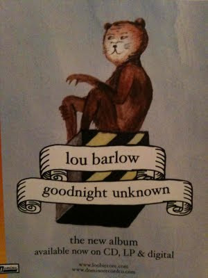
This magazine advert for Lou Barlow, Pete posted on the blog and the album cover for the band was a influence on my advert and digipak designs as it uses a simple design and they both link into one another really well.
magazine cover:
album cover:

Such as the background - I need to make this the greeney/teal I've used in my digipak and instead of using my digipak cover I'm going to take the tree from the cover as my focal point and in information around it as Nick said that I didn't really need to have an image of the actually digipak as my digipak is simple so my advert needs to repersent this aswell.
This magazine advert for Lou Barlow, Pete posted on the blog and the album cover for the band was a influence on my advert and digipak designs as it uses a simple design and they both link into one another really well.
magazine cover:

album cover:

Magazine Advert Research
I was looking at previous magazine adverts from last year and I found this one I actually love!

It's for Kirks music video he created of Ali (who happens to perform in our video) and it looks really effective.

The only fault I can say about this is the font/text positioning, everything else is amazing and it's such a powerful image that would really draw your eyes to it in a magazine.
Au Revoir Simone research
Although my group and I have already done a lot of research on the band (See keynote pitch) I decided to look more into their album art work and the features they've done for magazines. Their website was very helpful for this (http://www.aurevoirsimone.com/)


Editing
Today we have been continuing editing our music video. We mainly focused on adding in our cut aways and making things flow together better, as suggested we do in our feedback from our rough cut. We have a strong idea of where we want to go with our video so tomorrow and Friday's editing sessions will be productive.
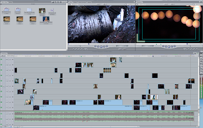
This is our (messy) timeline
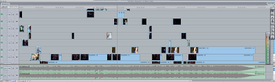
This is our (messy) timeline

Monday 8 March 2010
Final Digipak?
This is my digipak I made using the front cover idea I had. I used this still from our footage and faded it over the top of the teal background, I did this for the back cover and the side fold. I then used the image I used as the background of the tree on the front cover as the inside of my digipak. My digipak also includes two disc's - the first is the album 'Still Night, Still Light' and the second a bonus dvd of the making of 'Shadows' and an exclusive interview with the band, I think this would really appeal to Au Revoir Simone fans. On the back cover of the digipak I have included a bar code and the label Moshi Moshi, which is Au Revoir Simone's UK record label.
Fold/Back cover/Front cover

Tray two/Fold/Tray one
(Click on pictures for larger images)
I understand that a few people are making like lyric books as an extra however I decided not to do this as my digipak features an extra bonus dvd which is better in my opinion.
Fold/Back cover/Front cover

Tray two/Fold/Tray one

(Click on pictures for larger images)
I understand that a few people are making like lyric books as an extra however I decided not to do this as my digipak features an extra bonus dvd which is better in my opinion.
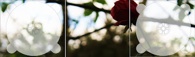
Digipak Cover Idea

This is one of my digipak front cover idea's I created on Photoshop using an image I took a while ago and a tree stencil I found online. The font needs a bit of working on, however i'm keen on the positioning, colour and size. as you can see I used the title of au Revoir Simone's latest album as I think it fits in well with the concept and ideas we've had for this project.
I'm not sure if I like it yet, but it's one possible idea. I like the simplicity of it though, and I think the colours fit the songs and the Band well.
The image of the tree also relates into our music video as our band performance is set around a tree with lights and wonderland props. However I may change the background image to something like fairylights - just so it fits in better with our video.
This is the photo I used as the background image of the tree. It's my own photo which I took last year on my father's Canon EOS 450D - so no copy right issues there.

Screen grab of work in progress

Rough Cut Feedback

Our feedback booklet
The feedback we received from our class today is made up into two categories - strengths and improvements.
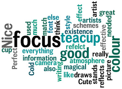
The strengths we received included:
- I like the use of shots
- Fading shots together works well
- Great atmosphere and composition
- I like how the background is fast and Emmais normal pace
- The atmosphere fits the song
- Good use of effects e.g. the timelapse + stopmotion
- Good lip syncing, instrument playing, lighting, cards, costume, location and effect
- Great opening shot
- Great shots of cards
- Feels like a music video already - set the scene with close up's very effective. First chours made me smile
- Varitey of camera angles/cut aways
- Scene set up well
- I like the night theme with the flashing lights and the cards spinning round
- Good performance and locations
- The opening is amazing: effects, shots, lip syncing, mise en scene, costume (there were ticks by all of these)
- Love the tea party sped up scene
- The tree with lights look great
- I like how the footage blurs then focuses
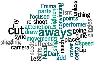
The improvements/weaknesses received were fairly similar. Most people thought some of the band performance was too dark and the contrast of this with the tea party being so bright made the video lose flow in some places
Other comments included:
- Too Dark in some places
The improvements/weaknesses received were fairly similar. Most people thought some of the band performance was too dark and the contrast of this with the tea party being so bright made the video lose flow in some places
Other comments included:
- Too Dark in some places
- Less movement from singer - needs to be more focused on camera (there's not much we can do about this unless we re-shoot, which we don't have time for)
- Lip sync is off in some points or Emma giggles (we're going to cover up the giggling with cut aways)
- Should add more cut aways
- Try out effects on certain parts or brighten them up
- Need to draw attenetion to the speed up thing
- In some bits the performer isnt convincing
Sunday 7 March 2010
Today I have been working on my digipak, just creating some of the idea's I have on paper. I'll update you with these soon.
Tomorrow we're going to be giving feed back to everyones rough cut music video. I'm looking forward to seeing what people have produced and seeing what people think of our work. However at the same time i'm worried that people will pick out the faults in our rough cut, such as the lack of cut aways and the giggling and such..
But it's only our rough cut and we havnt added our cut aways in or fixed any problems with our footage yet.
Friday 5 March 2010
ROUGH CUT
SHADOWS ROUGH CUT - Christina, Emma and Rob from cmdiploma on Vimeo.
This is our rough cut music video, it's a bit bland at the moment as all it seems to be in lip syncing of the song as we havn't added our cut aways in yet because we started off by building up from syncing everything up first. as you can see we've added dissolves at the beginning of our music video - Steve suggested we do this however I said you don't really see dissolves in music videos but I added them in anyway and i think they work fine at the moment.
Out of Focus Footage Cover up
I came up with an idea to hide the fact that some of our footage is out of focus or in soft focus. Basically on the Final Cut Express timeline I copied the clip that was out of focus pasted it on top and moved it slightly out of sync, then added a dissolve. This technique works really well to cover up the out of focus footage and it looks effective. It also fits in with our fairy-tale concept and creates a really interesting atmosphere.


Subscribe to:
Posts (Atom)